Bootstrap 5: Build Responsive Websites
About Course
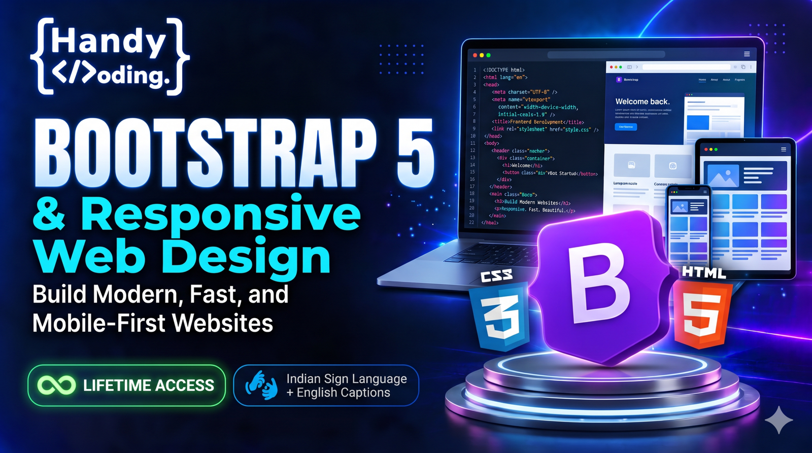
Learn to build responsive, mobile-friendly websites faster with Bootstrap 5, the most popular CSS framework. This course takes you from adding Bootstrap to your first page to building complete responsive layouts, with plenty of guided practice along the way.
Every lesson is taught in Indian Sign Language (ISL) with visual demonstrations, so Deaf and hard-of-hearing learners can follow along comfortably.
What you’ll learn
- How to add Bootstrap 5 to a web page and how the framework works
- Containers, rows and columns: the Bootstrap grid system
- Responsive layouts for phones, tablets and desktops
- Ready-made components: navigation bars, buttons, cards and forms
- Accordions, alerts and modals
- Utility classes for spacing, colours, text and alignment
- CSS media queries for your own responsive styles
What you’ll build
Five guided Bootstrap practice sessions where you build pages step by step, a media queries practice project, a practice assignment and two quizzes to check your understanding.
Who this course is for
- Learners who know basic HTML and CSS and want to build websites faster
- Deaf and hard-of-hearing learners who want to learn frontend development in ISL
- Anyone who wants mobile-friendly websites without writing every style from scratch
Requirements
- Basic HTML and CSS knowledge
- A computer with a code editor (VS Code recommended) and a web browser
- Basic English reading skills for the captions and course materials
Course Content
Introduction
-
A High-Level Overview of Web Development
03:49 -
Caution – HandyCoding
02:06 -
Meet Your Instructor HandyCoding
02:17
Bootstrap
Responsive
Q&A
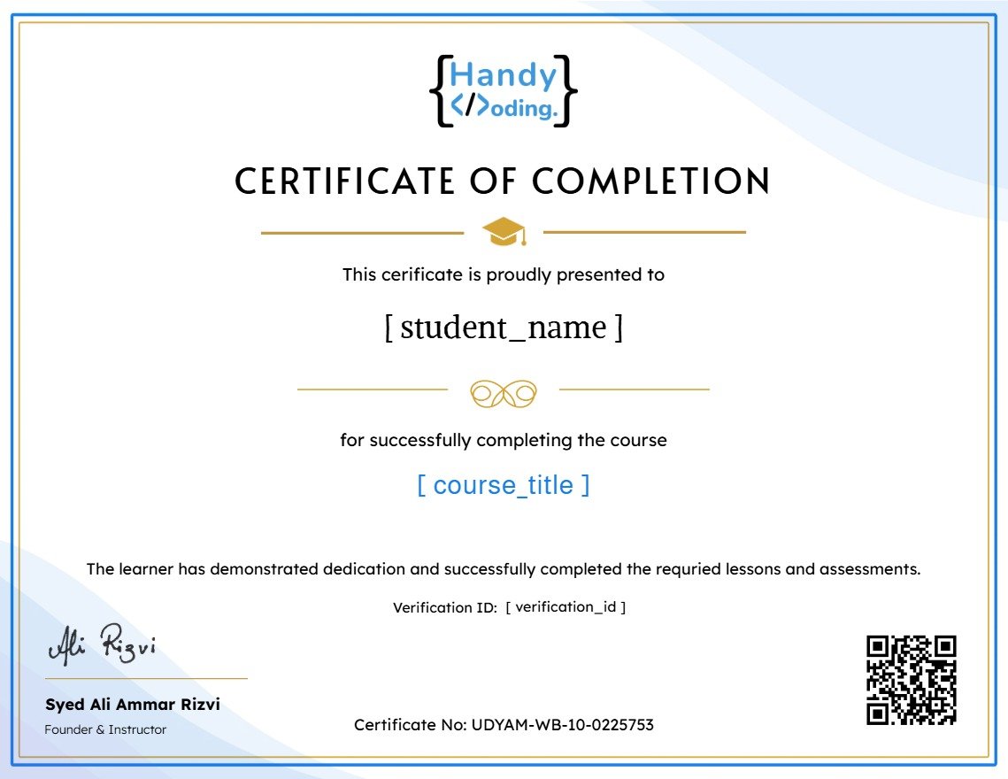
Earn a certificate
Add this certificate to your resume to demonstrate your skills & increase your chances of getting noticed.
Student Ratings & Reviews

No Review Yet