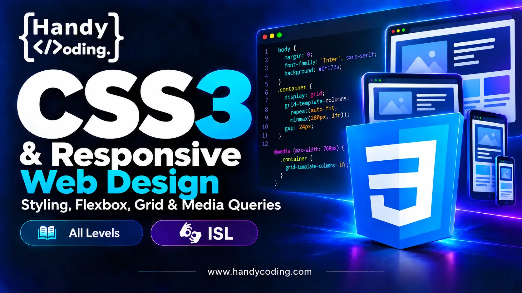
CSS3 & Responsive Web Design: Styling, Flexbox, Grid & Media Queries
About Course
Learn to style modern, responsive websites from the ground up. This course takes you from your first CSS rule to complete layouts that look great on phones, tablets and desktops, using the tools professional frontend developers use every day: CSS3, Flexbox, CSS Grid and Media Queries.
Every lesson includes ISL sign language tips, so Deaf and hard-of-hearing learners can follow along comfortably.
What you’ll learn
- CSS fundamentals: selectors, specificity, the cascade and inheritance
- The box model, units (px, %, em, rem, vw/vh) and spacing that scales
- Colors, typography, backgrounds, borders, shadows and gradients
- Flexbox for navigation bars, cards and alignment problems
- CSS Grid for full page layouts and image galleries
- Media queries and a mobile-first workflow
- Transitions, transforms and simple animations
- CSS variables (custom properties) for maintainable styles
- Accessibility basics: focus states, contrast and readable layouts
What you’ll build
Hands-on projects in every section, ending with a complete responsive landing page you can add to your portfolio.
Who this course is for
- Beginners who know basic HTML and want to make their pages look good
- Self-taught developers who want to finally understand Flexbox and Grid
- Anyone who wants a solid, accessibility-first CSS foundation before learning frameworks like Bootstrap or Tailwind
Requirements
- Basic HTML knowledge
- A computer with a code editor (VS Code recommended) and a web browser
Course Content
Introduction
-
A High-Level Overview of Web Development
03:49 -
Caution – HandyCoding
02:06 -
Meet Your Instructor HandyCoding
02:16
CSS
Responsive
Q&A
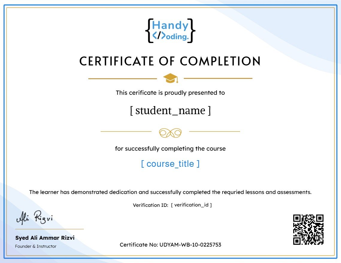
Earn a certificate
Add this certificate to your resume to demonstrate your skills & increase your chances of getting noticed.
Student Ratings & Reviews

No Review Yet